TPA Connect
CLIENT
Swire Properties
MY ROLE
Lead UI, UX, Interaction Design, User Research, Visual Design
RESULT
Within 6 months of launch, the app uptake and usage reached 50% of tenants at Taikoo Place Apartments
RELEASED
2016


BUSINESS PROBLEM
The 24-hour concierge service adds tremendous value to their brand, however, it is difficult and costly to facilitate.
Taikoo Place Apartments (TPA) is a premium serviced residence in Hong Kong’s eastern business district, Quarry Bay. They're known for their luxury design, top-notch facilities, and their round-the-clock concierge service.

USER PROBLEM
Transient TPA residents are often visiting Hong Kong for the first time on short business trips or staying for year-long work contracts.
Relocating to a new city for short periods of time can be stressful and overwhelming for newcomers.
THE SOLUTION
Digital Concierge
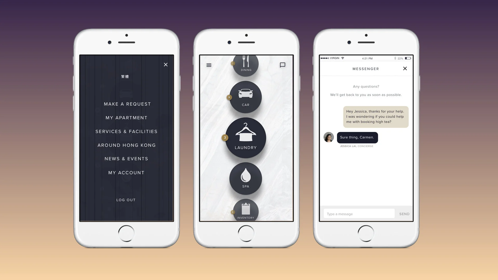
TPA Connect is a digital concierge service—a native app that supports the well-heeled residents at Taikoo Place Apartments 24/7.
This solution reduces the stress on the concierge staff while still providing top-notch 24/7 service to their luxury clientele.
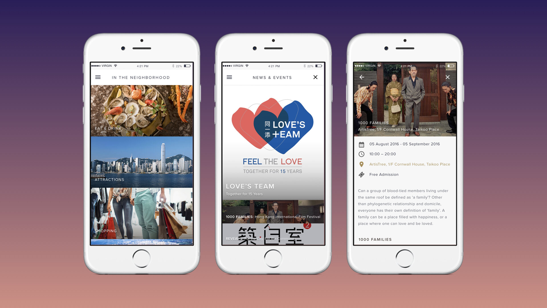
All of the services and amenities offered at Taikoo Place Apartments are available in the native app. Residents can easily make reservations for a spa day, schedule laundry services, order fresh bedsheets, silverware, car services, file maintenance requests—all with a tap of a button.

ADVOCATE FOR USER RESEARCH
Working within an agency model can sometimes feel like an uphill battle. Not only was time a constraint, but there was a lack of support for user research due to misaligned philosophies.
Regardless of the constraints, I found ways to bring user empathy into the process by interviewing TPA staff and touring the entirety of Taikoo Place Apartments. My learnings significantly changed the direction of interface and interaction design. Our client was excited about the new direction from my research.
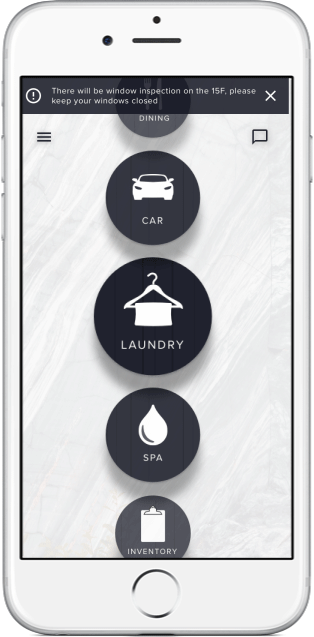
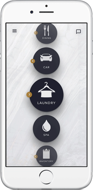
DYNAMIC NAVIGATION
After exploring several unique interfaces, I designed a dynamic scrolling primary navigation.
The interface takes cues from the interior design in Taikoo Place Apartments and moves in sync with the user's scrolling. The unique design appeals to their well-heeled clientele.
I prototyped interactions and transitions in Principle and After Effects. For the rest of the user flows, I created a clickable prototype in InVision.
SIMPLE USER FLOWS
Our goal was to simplify the daily lives of our users at Taikoo Place Apartments, so it was essential to clear away any extraneous steps.
The progress bar at top reassures the user that there are only a few steps to completion. Each step is uncluttered and straightforward. A confirmation screen at the end signals to the user that the task is complete.
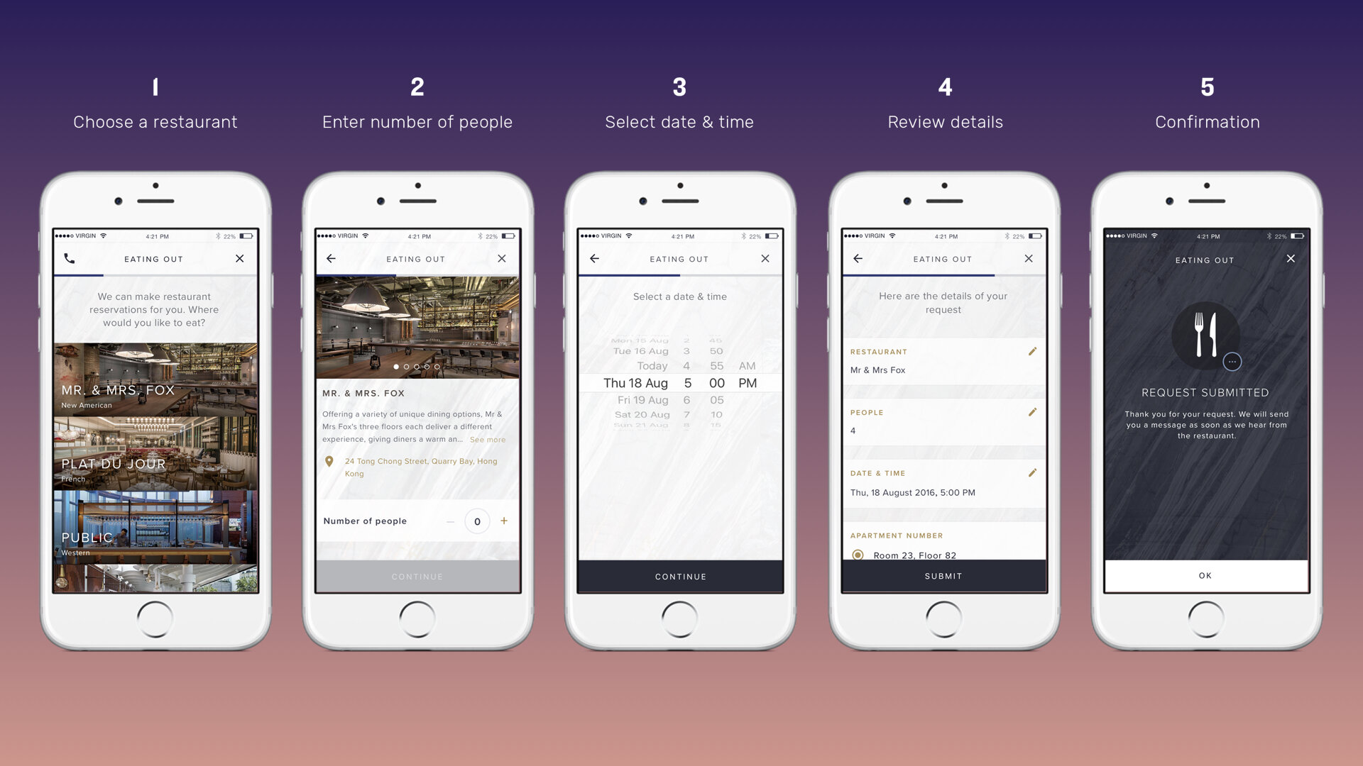
Progressive Disclosure: Less can be more. For this restaurant-booking flow, fewer choices on a single screen and more screens prevent cognitive burden on the user.
USER INTERFACE
Craft is critical in interface design.
I take precision seriously, creating consistent interaction and interface patterns throughout an experience.
Software constraints
Text bounding boxes in Sketch are inaccurate, which causes padding and margins to change slightly after designs are translated into code. Guides are great starting points and are expected to change while designing for multiple devices and operating systems.

Green guides: I designed a measurement system for consistency and structure throughout the app. This keeps our front-end developers happy and their stylesheets tidy.
The Results
Within 6 months of launch, we saw over 50% of residents download and actively use our app.
The native app has offered round-the-clock services for residents while easing the demand on human resources at Taikoo Place Apartments. Our service has bolstered their brand value as top-of-the-line service providers in the luxury apartment space in Hong Kong.
OVERCOMING CHALLENGES
What I Learned
PROBLEM
User research constraints
Our greatest constraints were the lack of time, budget, and support for user research.
SOLUTION
Low-cost feedback
Build more opportunities for learning by asking residents to rate their experience after services are completed. We could include “Feedback” or “Help & Support.”
PROBLEM
No discovery phase
The lack of problem discovery diminishes our opportunities to deliver a truly powerful application.
SOLUTION
Diverse stakeholders
Spend more time in and out of the facilities. Talk to a variety of stakeholders, not just residents, but also service personnel, managers, concierge, and travelers and locals shopping for apartments.
PROBLEM
Scrolling Primary Navigation
Although unique, the scrolling interface is not entirely practical when scaling. Would the service expand it’s categories in the future? Thin vertical navigation is pushed below the fold.
SOLUTION
Diverse stakeholders
Spend more time in and out of the facilities. Talk to a variety of stakeholders, not just residents, but also service personnel, managers, concierge, and travelers and locals shopping for apartments.
PROBLEM
Missing expected features
Our app makes it difficult for residents to make quick decisions on where to dine. We merely surface names of restaurants
SOLUTION
Utilizing Yelp API
We could utilize the Yelp API (or similar API) to pull in ratings and reviews, and short restaurant descriptions. This content should exist on one page so the user can quickly and easily make their selection.
PROBLEM
Undeveloped iconography
There was little time spent on iterating on the iconography in the primary navigation and throughout the app.
SOLUTION
Researched iconography
Push the icons further and add sophistication to the visual language to communicate brand value. Make sure those icons are easily recognizable with user research.
6PROBLEM
Background imagery
The large background image slows down performance, particularly in older devices.
SOLUTION
Tiled patterns or solids
We need a lightweight and scalable solution. We could explore tiled patterns that reduce the size of the app and increase download speeds. Better yet, utilize solid neutral colors or subtle gradients.
Team
I worked with a small and tight-knit team. Here is a list of collaborators who had a hand in shaping this product.
Product Design
Kimberly Hulst
Harry Llufrio
Project Management
Eric Suen
Software Engineering
Onion Creative
Copywriting
Ruth Williams